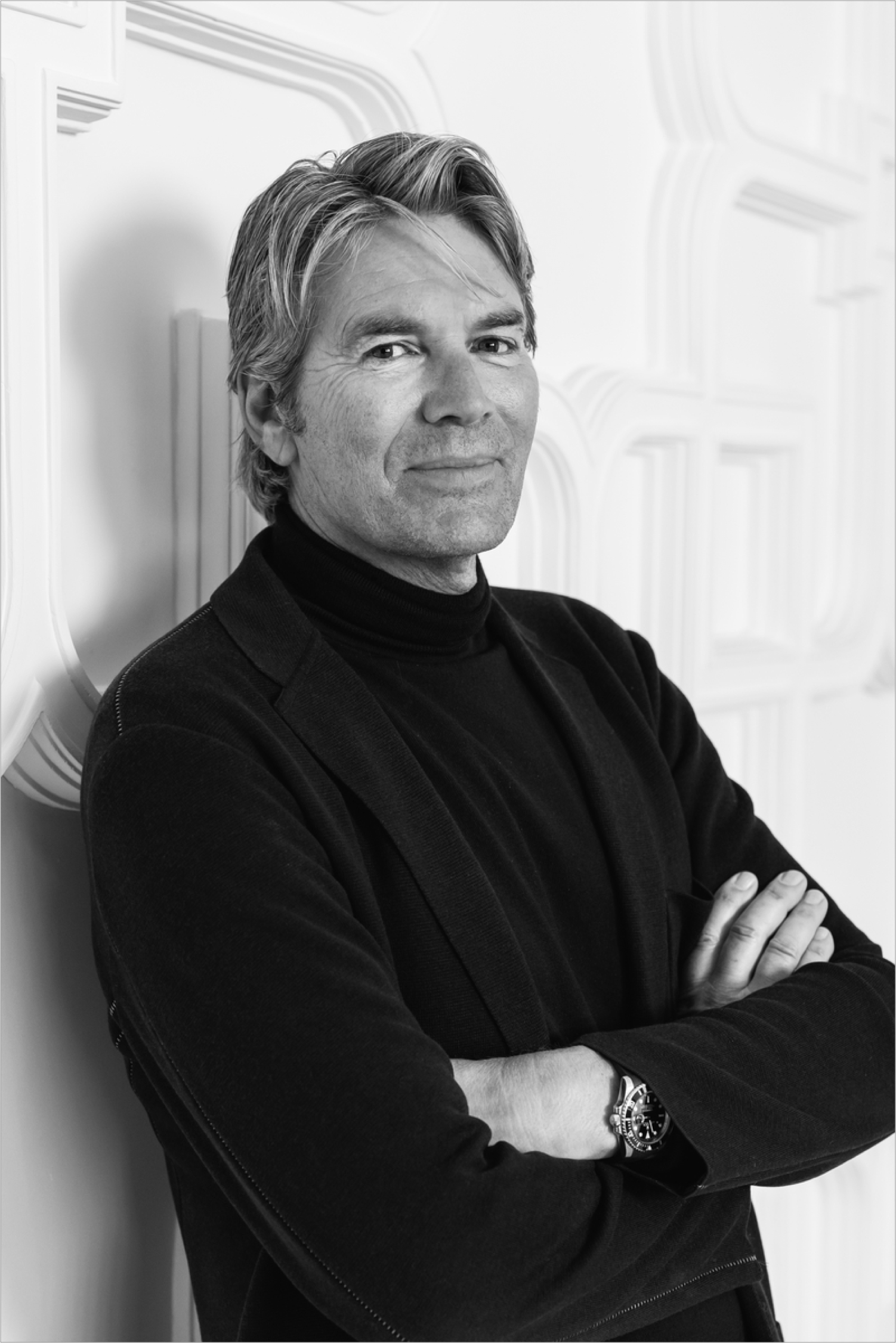
Long before Dutch Design burst onto the global stage at Milan’s Salone del Mobile in 1993, Piet Boon had quietly been developing his own design brand and aesthetic. With a down-to-earth approach to design, functionality and durability, the Amsterdam-based designer and his multinational team of creatives have gradually carved out a name with signature designs in the luxury segment that straddle the realms of interior design for private homes, hospitality and offices, real estate development, and last but not least, product design. On his design company’s 40th anniversary, an event which is celebrated with a beautifully illustrated, 500-page monograph, aptly entitled 40 by Studio Piet Boon, Superfuture sits down with the energetic, model-faced designer to pick his brain and get to know more about his growing business and elaborate creative output. The latter includes Rosewood Amsterdam, a soon-to-open luxury hotel which is bound to shake up the Dutch capital’s upper hospitality segment with unprecedented contemporary splendour.
This year, Studio Piet Boon celebrates its 40th anniversary. If you look back, what do you consider your greatest achievements? Also, are there any specific projects you’d like to do? Well, a significant project in my career was an apartment on Fifth Avenue in New York City which we designed. At the time, the property was known as the most expensive one on the market, so there was a lot of exposure, and being involved there put us on the global map. It wasn’t only a major breakthrough, but the whole experience was also exhilarating, changing our view on design and the way we design to a certain extent along the way. And more importantly, it opened doors to other major projects. Through the real estate broker, who happened to be one of the biggest real estate developers stateside, we were later on asked to design villa and housing complexes in California, Arizona and Virginia. You know, I really can’t name a favourite project. We’ve done so many and diverse projects. I mean, right now, we’re building a hotel resort on Miyako, a resort island in Southern Japan, and I’m a big Japan fan for many obvious reasons.
But at the same time, for me, constructing a villa here in the Netherlands or redeveloping a canal house is just as interesting or fun to do. The latter requires a personalised approach and often a very intimate interaction with the client, creating a bond. I simply enjoy doing both small-scale and big projects in various fields. Speaking of which, we recently designed the trophy cups for the 2023 Dutch Formula 1 Grand Prix in Zandvoort in collaboration with the Royal Delft porcelain factory, which was great fun! So, the three trophy cups were given the colours of the Dutch flag—the third place trophy cup in blue, second place in red, and the number one trophy cup, because we simply knew that Dutchman Max Verstappen would be the winner, in gold instead of the flag’s white middle band. That said, I’d also love to work for a design-led mass consumer brand such as MUJI. A well-designed product doesn’t have to be expensive and should be available to all, and products of this brand are bought by so many people, it’s a community, and that’s fantastic! The very same is the case with IKEA, a very strong brand and large following.
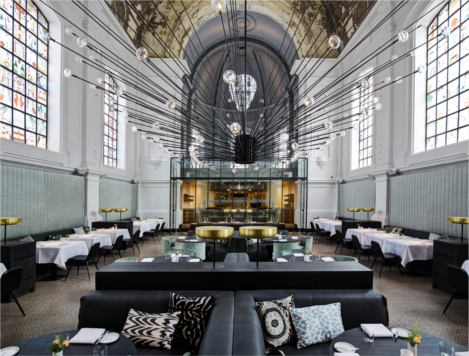
What does your company look like? Please elaborate some more on your company’s structure, number of staff, freelancers, departments etc.? We have a staff of 70 people, and they’re working here at our headquarters in Amsterdam. We actually don’t have any freelancers working for us. When we were doing the aforementioned project in New York City, we had a small office there as well at the time, but I think such an outpost is no longer necessary. Ideally, you’d want everyone in one place, simply for the necessary creative cross-pollination. We have many different nationalities working at our office who not only bring, along their expertise, but also priceless cultural information. If we’re engaging in a project in Asia for example, we have people in-house who know about, let’s say, Feng shui, and we have native English-speakers who can sniff out actual opinions concealed behind polite business conversation, so having such staff is a total asset. Studio Piet Boon has five different teams, each working on different projects, and we have a design team dedicated to product design, creating things such as furniture, tableware, the aforementioned trophy cups, and recently, a series of carpets for cc-tapis. I depend a lot on the expertise of my staff, but I also actively engage in the design reviews of many projects, and obviously, I share my opinion. I just love the energy and wild ideas of new staff members at Studio Piet Boon, but at the same time we’ve developed our own design codes, a certain aesthetic which is based on functionality, so their onboarding usually takes some time to fit in. I’ve got such a great team now.
The language and codes of luxury are very specific. How did you make it your own and what’s your own definition of luxury? To me, the definition of luxury is: comfort, durable and functionality. I started working in the luxury segment when accepting the assignment for the Fifth Avenue apartment. I think I was able to identify with the client because he was also a ‘self-made’ kind of guy. Frankly, most of Studio Piet Boon’s clients are like that for some reason. Now, many years on, people know our track record, our aesthetic, and what to expect if they hire us—it’s then our job to exceed those expectations. Therefore, I need to listen closely to what our clients want, and at the same time, give them advice and guidance. Our design is durable and is intended to age beautifully, so the choice of materials is important. And as said, functionality is always key.
How would you describe the design codes or aesthetic of Studio Piet Boon? Well, I’m very down to earth. As such, my design approach is first and foremost practical. Generally, the design needs to match with the client’s requirements, and in terms of technicalities, I always closely look at the synergy of a design, its linearity, the right volume of spaces. If I had to describe my style, I’d call it barefoot chic, simply because it’s somehow laid-back, and also, it’s meant to be durable and age beautifully. I guess our design is very Dutch, in a way. But then again, in sharp contrast, we’re also currently working on a Baccarat hotel project in Riyadh that’s going to be full of mirrors and feature a twelve-metre chandelier. We have to comply with the client’s strict design guidelines, but it’s an interesting challenge.
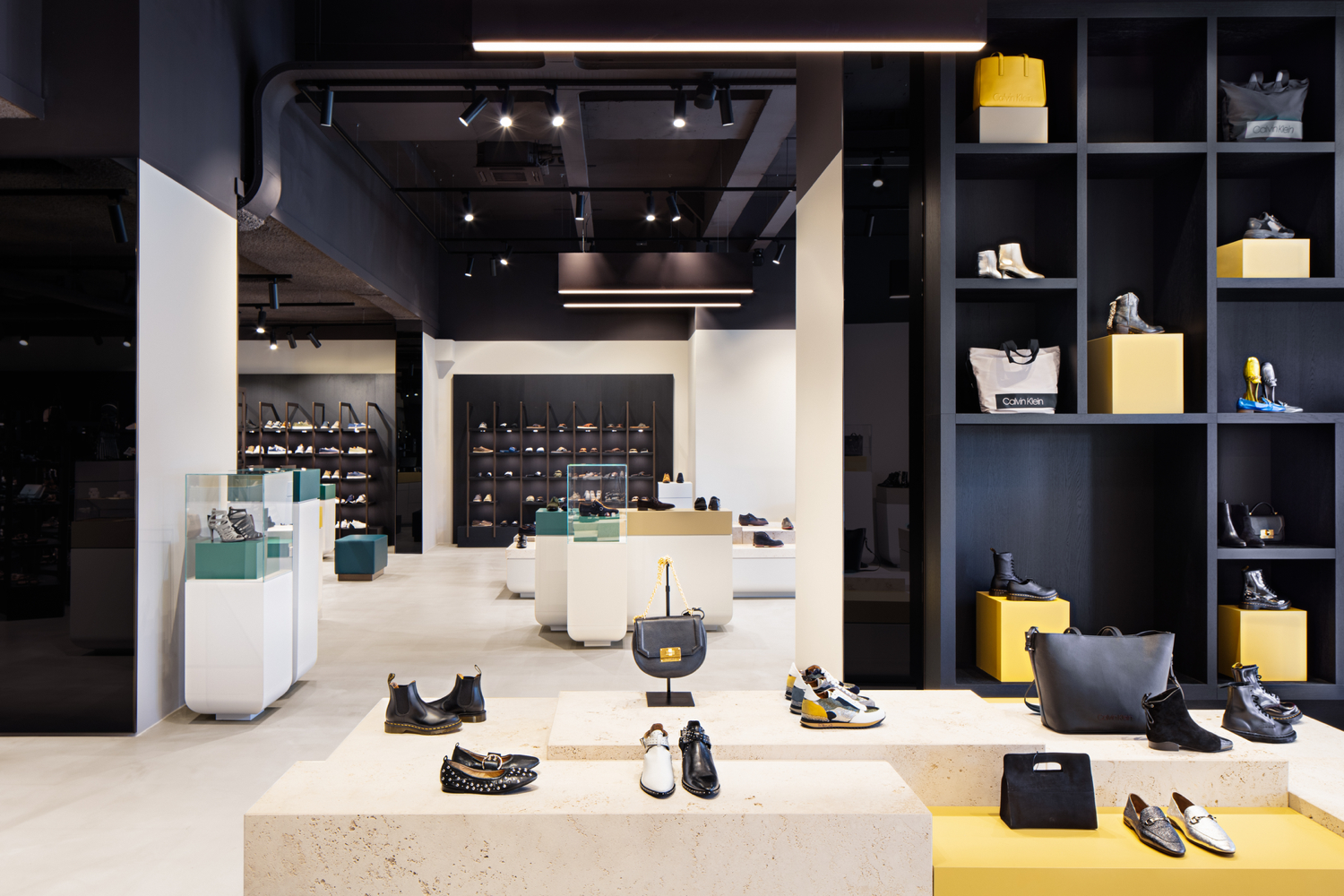
What are your sources of inspiration? Are there any designers or architects you admire? Tadao Ando is my absolute hero, but I also admire Vincent Van Duysen. I love everything he designs. Studio Piet Boon’s design is a tad more accessible and geared towards comfort, I think, while his design is more minimalistic. By the way, I once worked with Tadao Ando on a project in South Korea, which obviously was amazing! I go to museums and trade shows quite a lot, or shop at interesting fashion stores, you know, I always pick up on things while I’m out and about. Also, I travel quite a lot and make sure I’m staying in cool hotels which I also find inspiring.
Your clients are predominantly from the upper lifestyle segments. What are these segments’ main challenges for you as a designer? Listening. I mean, listening closely to your client. There’s nothing worse than working with a designer who doesn’t hear what a client says and creates something entirely different. So, we do our client interviews very thoroughly.
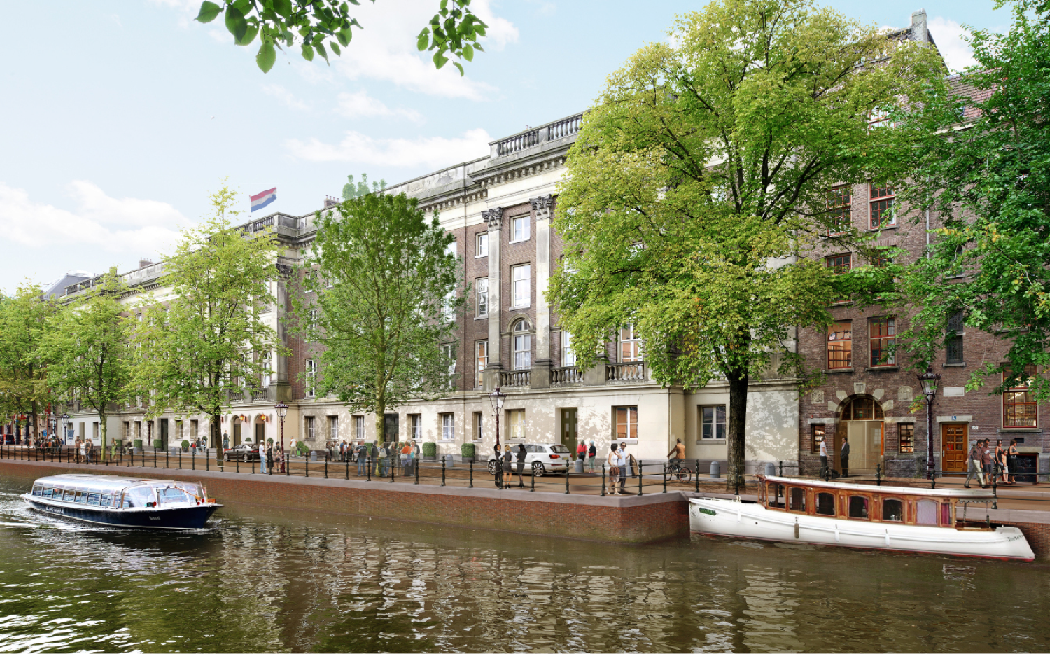
A major current project of Studio Piet Boon is the Rosewood hotel which is situated in a listed landmark building in Amsterdam’s Canal District. What can you tell us about the interior design? We won the pitch for this project six years ago, and it has taken a lot of time before we actually started working on it. You know, architecturally, it’s a very complicated building. For example, on a location at the far right of the property, right next to a side canal, a spa will be situated 10-metres below ground, meaning that a sheet pile wall had to be installed in the building first before we could proceed. Also, both neighbourhood dwellers and the Dutch architectural heritage agency were constantly breathing down our neck, causing many delays. The latter entity, for example, determined that the building’s colour palette needed to be the very same as the original colours that had been used. The walls of the implemented bathrooms couldn’t be extended all the up to the ceiling because it’s an original element of the building and thus it’s protected. Also, each room has different dimensions, adding more work hours.
I tell you, it’s a very intricate, challenging project. All this, and also COVID, resulted in a delay of about two years. As for the interior, I can’t give away any details yet, but we’ve created a sense of place, meaning that once you’re on the premises of Rosewood Amsterdam, you’ll instantly know you’re in Amsterdam. So, upon entering the building, you’ll first encounter a gallery of honour, similar to the one at Rijksmuseum, with an artwork at the end as an eye-catching focal point. But you’ll also find a waiting area and a bar here. It’s meant to be very accessible and welcoming. The building has three gates, but we took out the doors, and also installed beautiful fencing similar to Rijksmuseum’s. The owner of the Rosewood hotel group has a truly amazing private art collection from which we were able to select pieces. Additionally, in collaboration with creative agency …,staat, we’re currently picking works from a variety of contemporary Dutch artists and designers, such as Studio Job and lensman Anton Corbijn. Mind you, we’re also commissioning pieces.
Publishers Note
Just to be clear – superfuture® is a design blog and not a political commentator. No surprise there. The scope of our content has always been global and borderless, however that can often mean covering projects in countries where we will not agree with the politics or actions of those countries. In a world that’s as screwed up as ever right now, the focus of our support is to those designers, architects and other creatives who aim to make the world a more liveable one – as opposed to people that try their hardest to destroy it. So if a project hits our desk and we like it based on its design credentials, we may choose to publish regardless of its location or creators nationality. superfuture® has always been inclusive and hopes for all current wars, aggression, violence, hate and extremism to end.


